

Home Decorating Tips
Decor Tips & Reminders: Working a Warm Color Palette

Mainly composed of reds, yellows, oranges, and greens, the warm side of the color wheel will always have the perfect shade you need to play up the coziness of any living space. Read on for tips on working with a warm color palette for your home, along with color ideas to get you inspired!
But First, a Few Color Considerations
When it comes to cooking up a new color palette for your home, it takes a little more than just picking colors. Much like painting or any other home improvement project, deciding on a new color palette will require a little research, planning, and a few considerations such as the following:
Color Options
It helps to know your options, especially with paint colors, as they’re never as simple as red, blue, and yellow. They come in a huge variety with tiny distinctions. Brown, for example, can be golden brown, cocoa brown, or wenge brown.
Room Function & Desired Mood
Colors can impact moods and behaviors. Blue and green, for example, are nature’s colors and they tend to relax the mind. This is probably why these two colors work better for bedrooms, baths, and libraries, rather than thought-stimulating colors such as red.
Aim for a cohesive ambiance. Decide on your room’s purpose and find the right color that works well with that purpose.
Physical Details of Your Space
Is your room or space small? Does it have access to good natural light? Colors also have the special ability to provide illusions. White tends to reflect light and make small spaces appear bigger and breathier. Dark colors may also widen spaces up but without White’s natural reflective property.
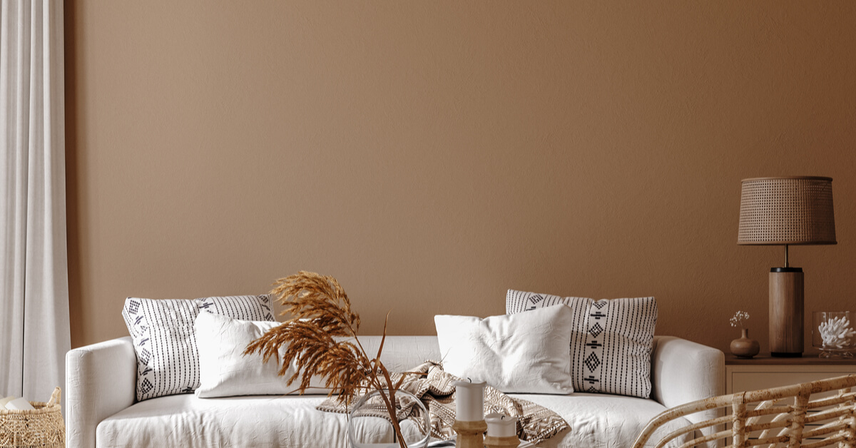
Sample Colors for Your Warm Color Palette
Why go for a warm color palette for your painting project? Because warm color palettes add personality to any space with the variety of effects they offer. These colors remind us of heat, passion, joy, and playfulness, but they can also make any room cozy and filled with intimate, positive energy.
Whether it’s for their warmth or for the energy they give off, these colors ought to be good additions to your warm color palette.
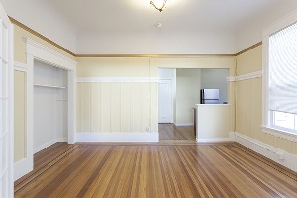
Mustard Yellow

Ready for ‘warmth’, but not sure about ‘bright’? The good news is that yellow comes in different shades. As featured in the image, mustard yellow on the wall gives off a peaceful glow and a cheerful vibe that’s grounded by its pairing with black-colored fixtures.
Pink

Gone are the days when pink was only used for nurseries and girls’ rooms. While lighter shades tend to soften, the stronger, darker shades of pink tend to add vibrancy and liven up spaces, such as that in the photo featured.
Maroon

Compared to pink, maroon is richer and dramatic, making it a perfect color for accent walls or for pairing with neutrals such as gray, as featured in the photo.
Red

Even more dramatic than maroon, red is intense. It forcefully draws your eyes towards it and that’s also how it visually expands a space. In the above photo, the rich red wall gives off an illusion that the space seems bigger than it is.
White & Yellow

Especially for busy spaces such as the kitchen, crisp white and yellow serves a functional and charming contrast. No need to fumble through stuff as you can easily find where each kitchen tool is!
Burgundy

Aiming for an ambiance that serves a luxurious feel? Burgundy may just be the main color you need in your warm color palette. Don’t forget to work in textures, classic patterns, and touches of gold or bronze in the decor plan!
Warm Color Decor Tips for Keeps
Got your warm colors ready? Take some time to play around with them. And to see if your colors and design ideas come together, consider visualizing your plan with a mood board. These pointers for working with a warm color palette should also help:
- Warm colors tend to work well with traditional decorating styles. For more modern styles, remember to keep your colors balanced and well spread out.
- Too many warm colors in a palette can be intense to the eyes. Try to balance the palette with a cool color or two. Pro tip: choose colors on opposite ends of the color wheel.
- Warm colors work great as accent colors too! For a palette that’s less energized, and more on the cozy effect, opt for a soft, cool shade as your dominant color and work in pops of warm colors into the decor plan
Available in 30 pre-mixed and 240 special mixed colors, Island ColorQuick Drying Enamel is an alkyd-based enamel that provides a vibrant, good gloss finish for wood and metal surfaces. Get more color ideas and tips from Island Premium Paints’ home improvement features.
Related Articles
Island Tex-a-Kote
Island Premium Paints’ Tex-a-Kote is an acrylic solvent-based coating, well-suited for a durable, decorative finish to your home decor.
READ MORE
How to Make a Rental Space Your Own
Renting a space to be closer to school or work can sometimes be dull and lonely but changing that can be as ...
READ MORE
How to Get Your House Ready for Summer
The cold days are coming to an end! It’s almost summer, and we’re already starting to feel the heat of the summer sun. You ...
READ MORE
Our Products
Our line of high quality paints and products will give your home or project the vibrancy it needs.
Explore Colors
Ready to explore colorful possibiliies today? View our popular paint colo combination palettes for great color schemes and room design ideas for interior and exteriors.